In Case You Missed It: This month’s ICYMI is adapted from a piece written by Andy Goodman in January 2006. In it, we dissect the cons of text-heavy PowerPoint slides.
Bad PowerPoint presentations waste time. For businesses and nonprofits alike, time is money. Tedious slide shows not only bore everyone, they also drain dollars from an organization’s bottom line. The question is: exactly how much money are these bad PowerPoints costing? In 2004, Max Atkinson calculated one answer.
A UK-based presenting and public-speaking coach, Atkinson derived a formula to determine how much money PowerPoint was costing the British economy in a single year. “If you take the number of managers in the country earning 30,000 pounds a year or more,” he says, “[assume they attend] one presentation for one hour a week, and you know 90% of the presentations bore them and they get nothing out of them, the answer is 7.8 billion pounds.” Or roughly 14.2 billion US dollars.
 With no dollars to waste, non-profiteers need to take a closer look at how their organizations use PowerPoint. If your slideshows feature few images, scads of text, and your presenters are reading that text to the audience, wasting time and money is not your only problem. These presentations are actually making it harder for the audiences to learn – a fact that was proven in 1998 and reported in Richard Mayer’s eye-opening book, Multimedia Learning.
The people in your audience have two channels for processing information: visual and auditory. These channels work simultaneously, so audience members are perfectly capable of looking at a slide, listening to the presenter, and making sense from both streams of information. These same people can run into trouble, however, when they have too much information to process at one time.
How much is too much? In 1998, Richard Mayer conducted a series of tests on college students to answer this question. Mayer created two sets of slides to teach students how lightning storms develop. The first set was comprised only of images (see figure 1) and as each slide was shown to the students, a narrator explained what the image was depicting. The second set of slides had the same images, but in this set the explanation was printed on the slide for the student to read (see figure 2). No narration accompanied these slides.
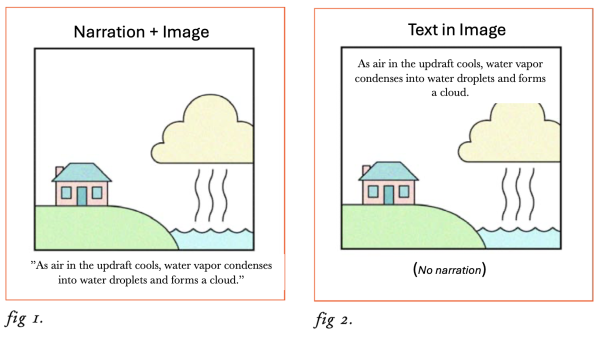
After reviewing the slides, the students were tested for retention of the information they had just been given. Even though the images and explanations were identical, the students who saw the images and heard the narrated explanation retained more than the students who saw the images and read the explanation themselves. Mayer repeated the test four times and obtained the same result every time. His conclusion: presenting a picture with narration allows the two information processing channels to work collaboratively. Presenting a picture with text overloads the visual channel (while ignoring the auditory channel) and can actually hinder learning.
To further test this theory, Mayer ran another side-by-side experiment with one critical difference. As before, the first set of slides showed images only accompanied by voice narration. The second set showed images with text, but this time narration was included as well (see figure 3). Once again, the students who saw the first set of slides retained more than those viewing the second set.
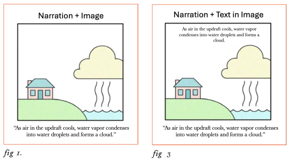
From these results, Mayer concluded that students viewing the second set of slides were hindered by two problems. As before, their visual processing channel was over-loaded with information. And instead of opening a second channel for learning, the narrator’s voice further aggravated the situation. When people read text on a screen while a presenter intones those same words aloud, Mayer asserts, the audience’s tendency is to listen for differences to determine if the printed and spoken words are, in fact, the same. And that means the audience is not focusing on the content!
“When making a multimedia presentation consisting of animation and words,” Mayer writes in his book, Multimedia Learning, “present the words as narration rather than on-screen text.” Like any rule, there are exceptions here as well, but as a general guideline for the design of PowerPoint slides, Mayer’s advice is worth heeding.
To learn more ways to engage audiences, register for our “Meetings for People Who Hate Meetings” Workshop on March 25 & 27.